"Power can be silent. Heat can be invisible. True identity burns from within, not through noise, but through presence."

MAGMA Essence is a conceptual fragrance branding project inspired by primal energy and the quiet power of transformation. The brand explores the connection between heat, identity, and form, a fragrance that embodies intensity without chaos.


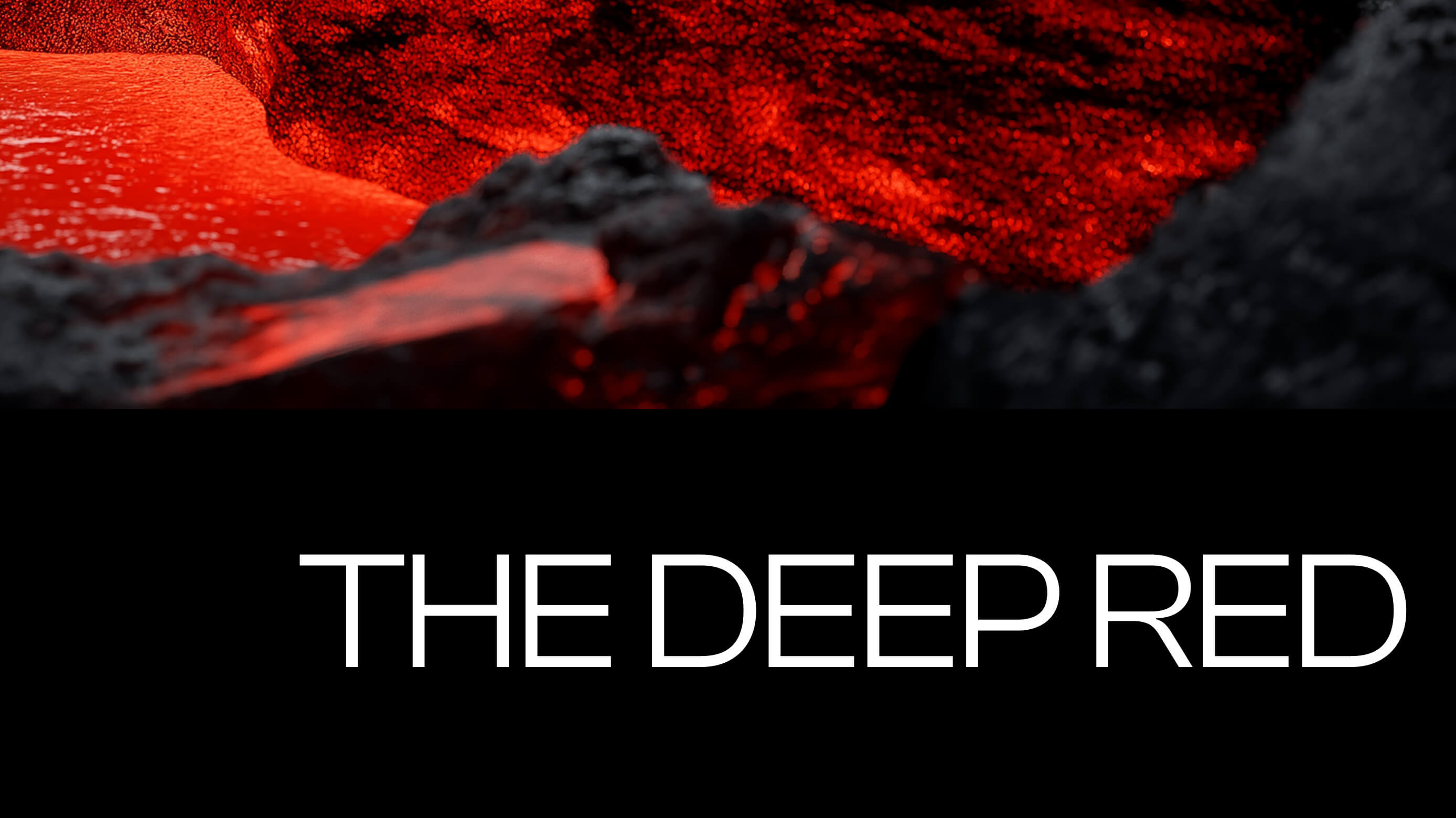
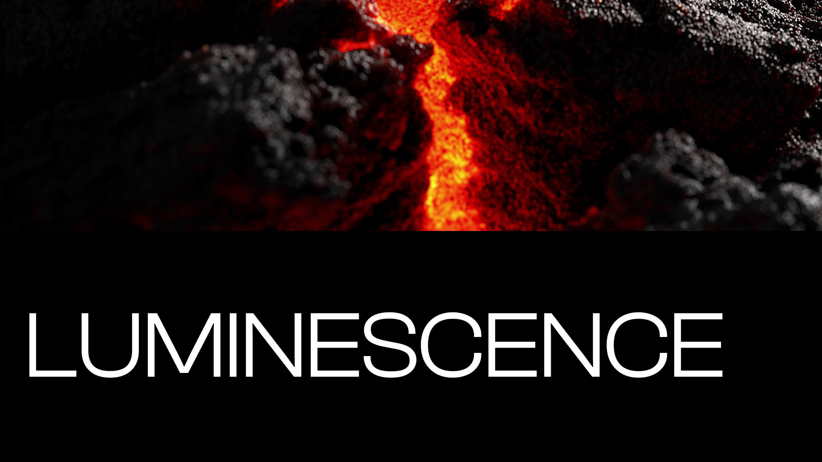
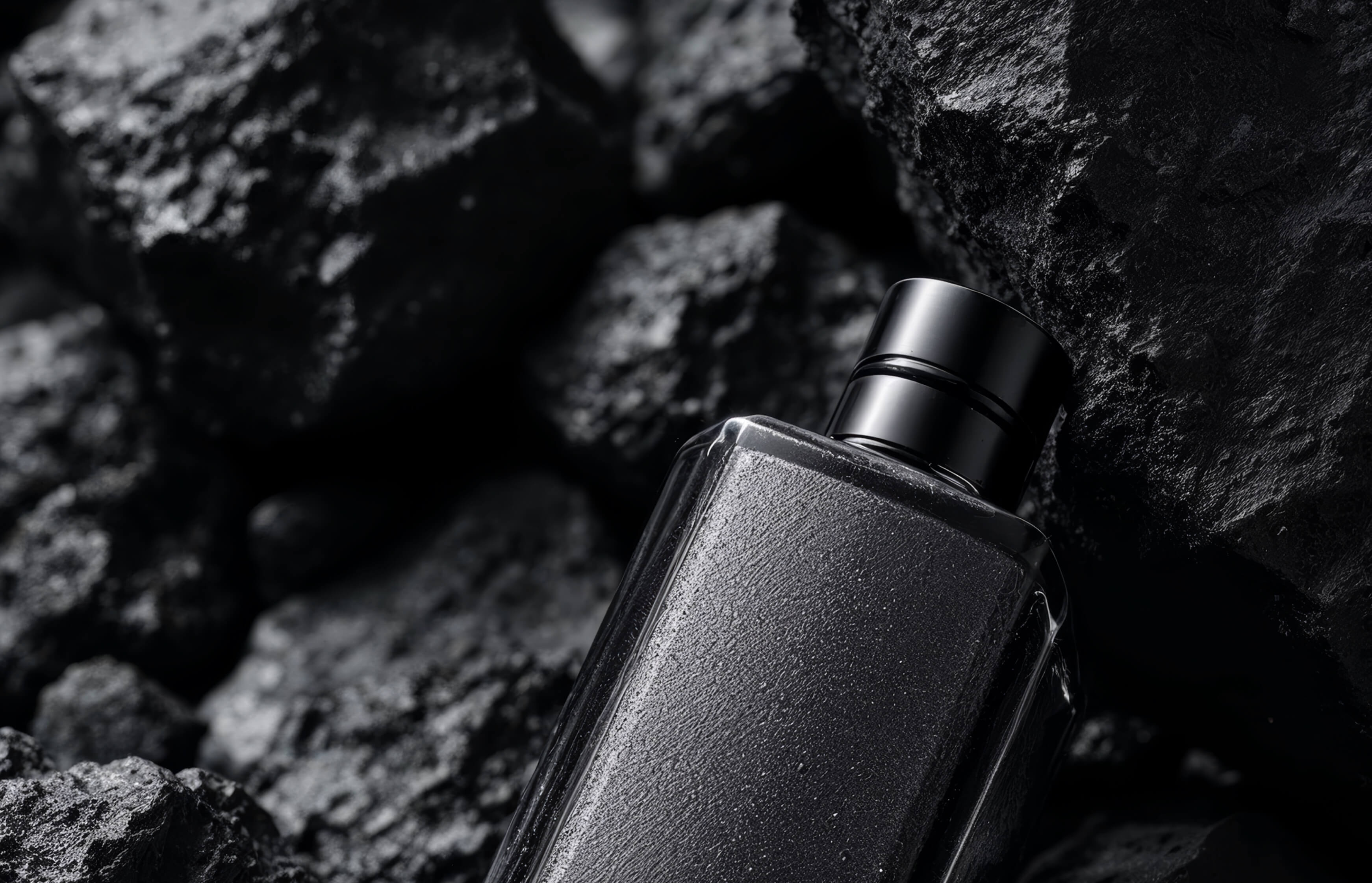
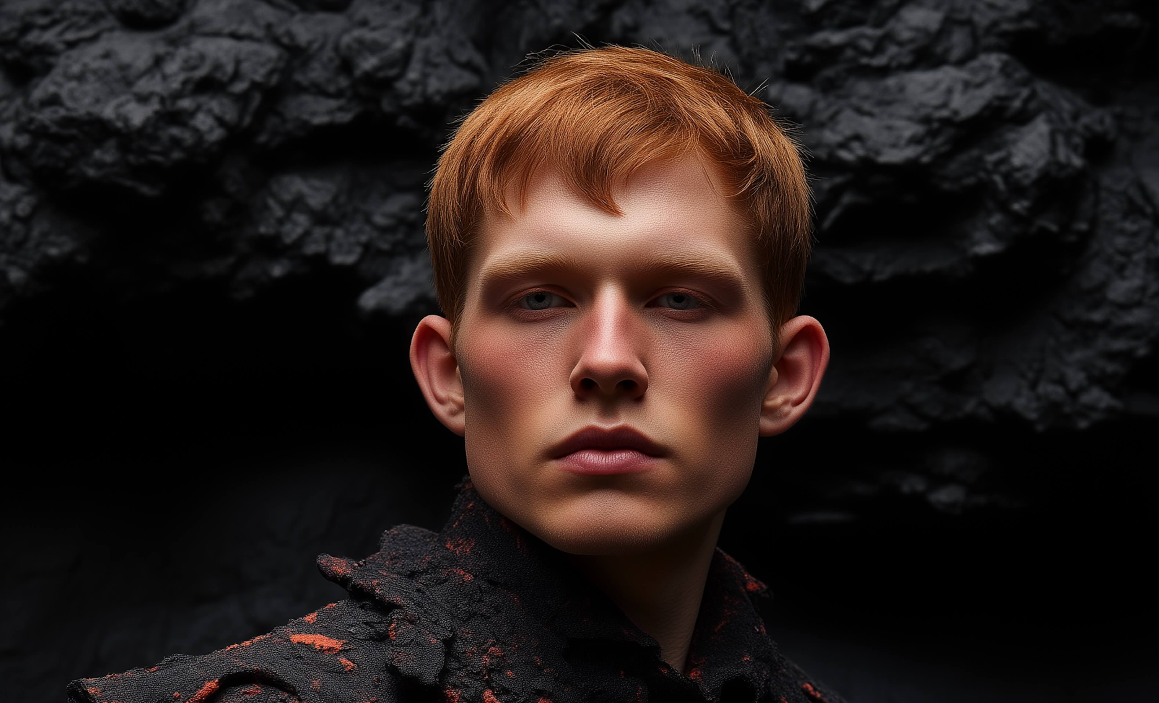
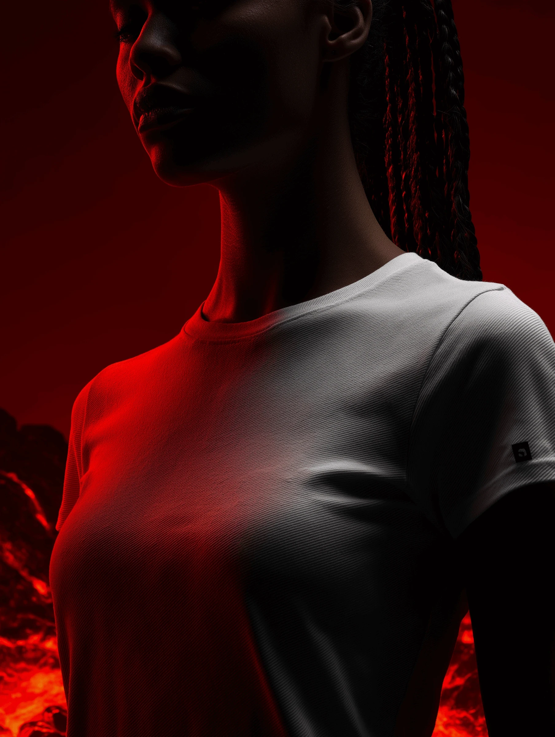
The visual direction centers on the contrast between raw earth and refined design. Textures of volcanic rock and liquid fire meet minimal, monolithic packaging that feels sculpted rather than manufactured. Every frame is designed to convey tension between restraint and eruption, the calm before ignition.
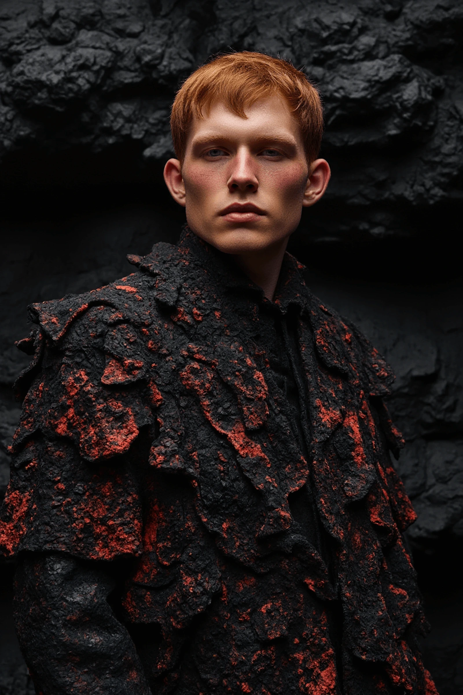
Model wearing textured volcanic jacket
Silhouetted portrait in red and black lighting
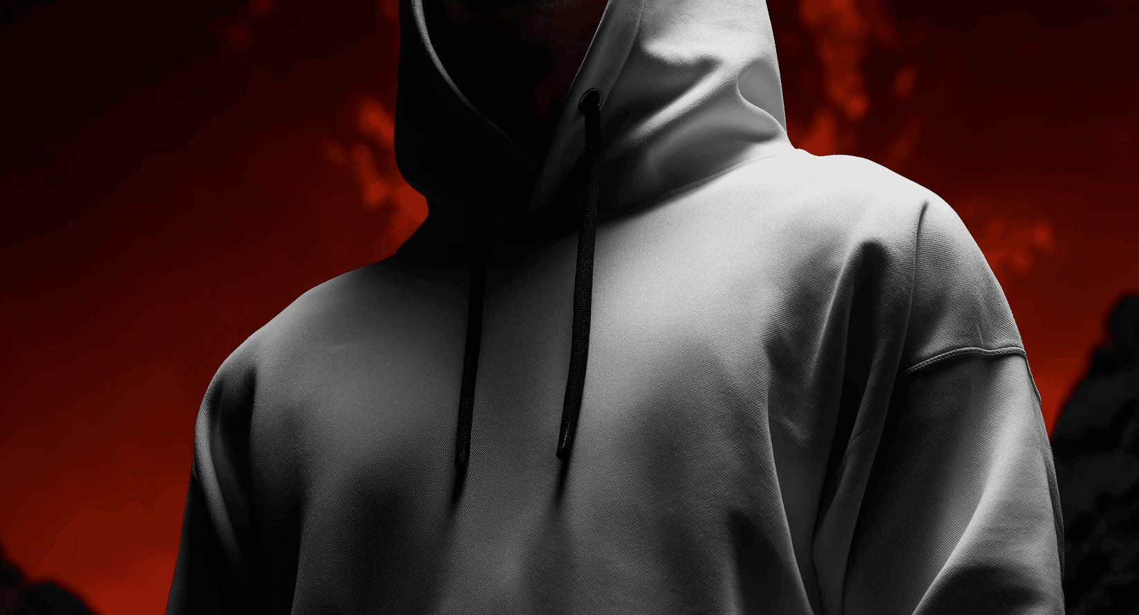
Person in white hoodie against a red background
Silhouetted portrait in red and black lighting
Person in white hoodie against a red background
Silhouetted portrait in red and black lighting
Person in white hoodie against a red background
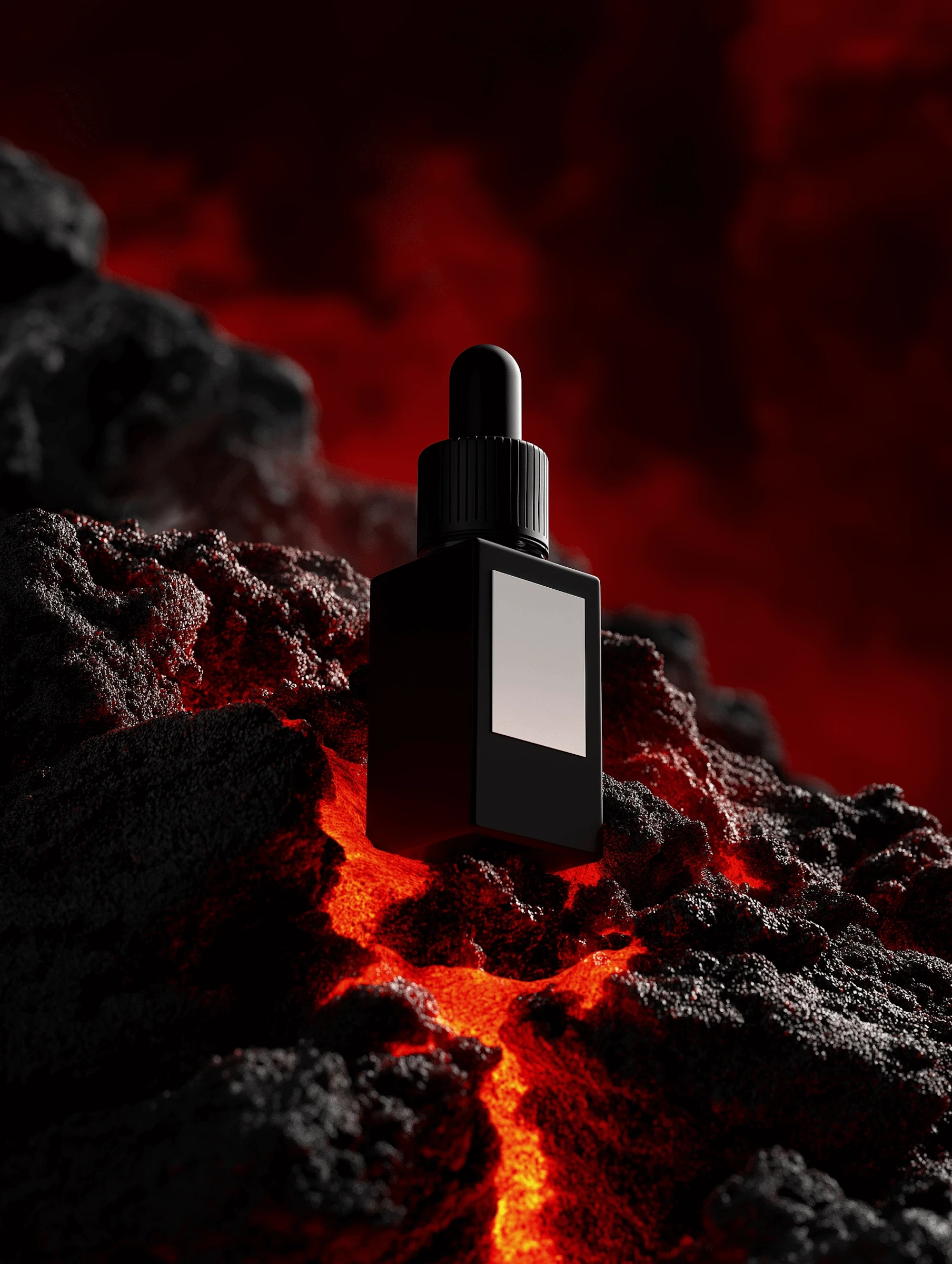
Black dropper bottle on molten rock
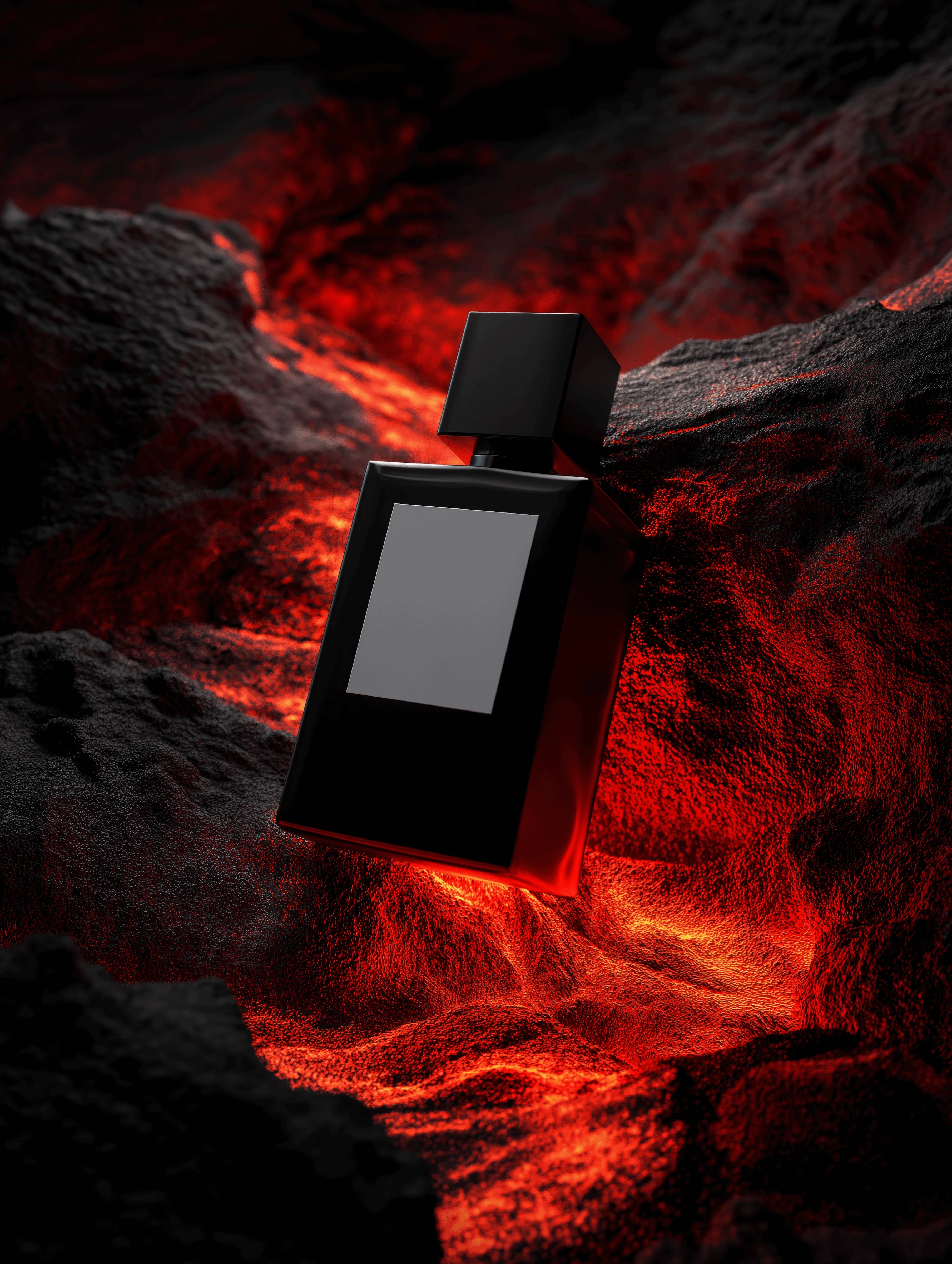
Perfume bottle resting over glowing lava
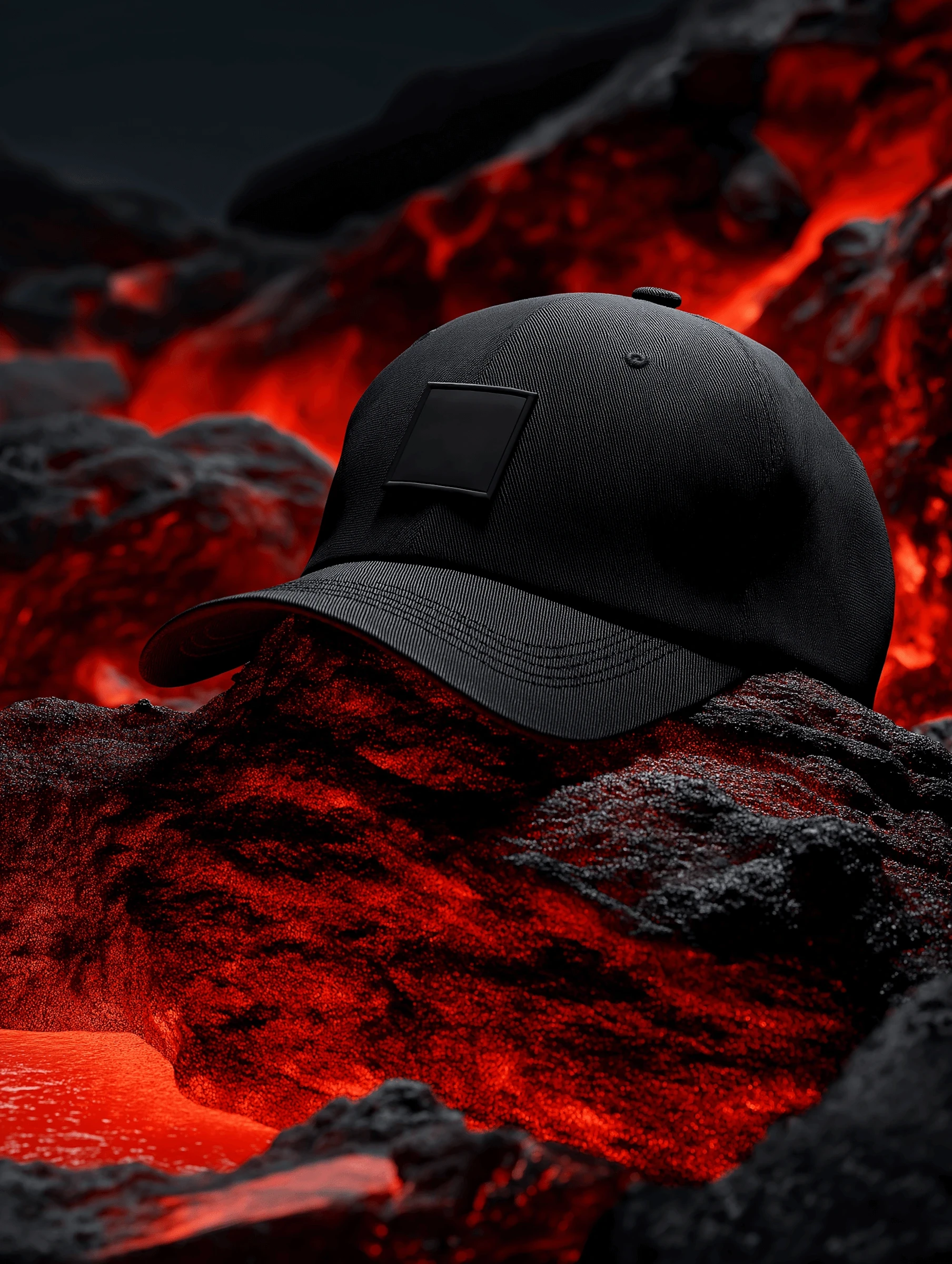
Black cap placed on volcanic surface
Silhouetted figure in red and shadowed light
Model wearing textured volcanic jacket
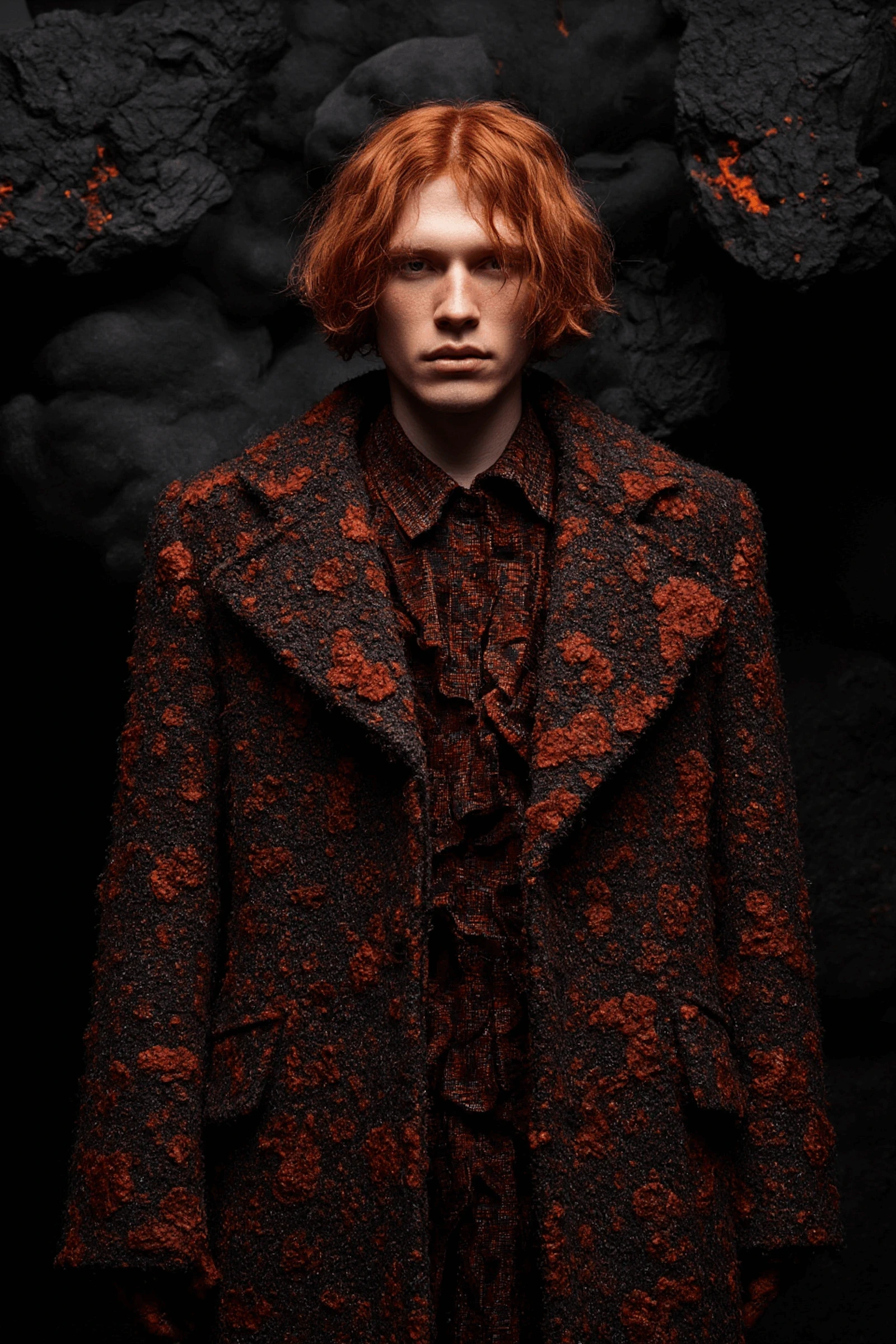
Portrait of model in lava-inspired coat
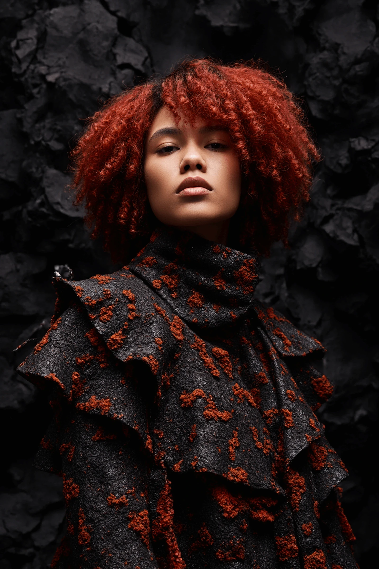
Female model in molten-textured outfit
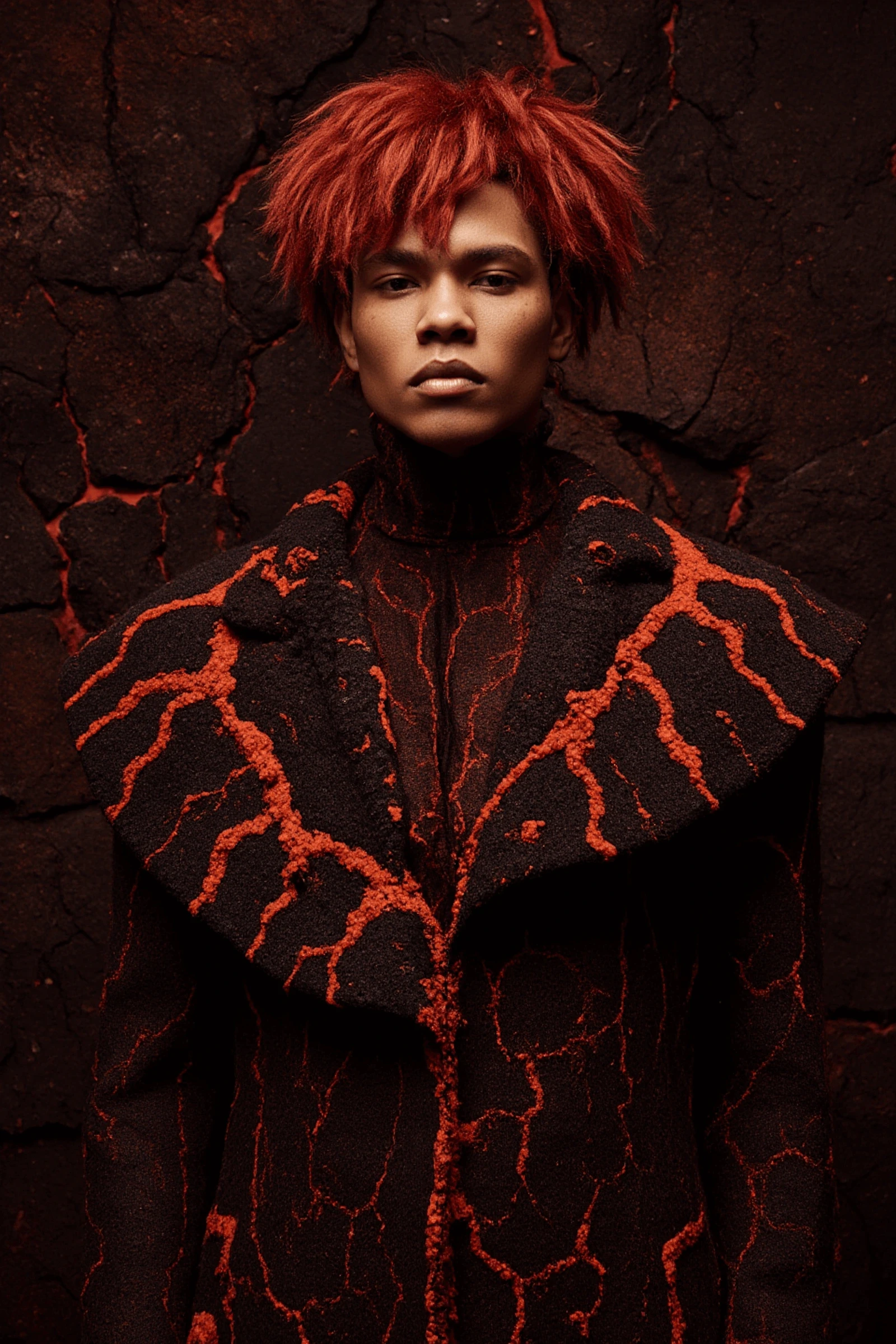
Male model in fiery red detailed clothing
Black dropper bottle on molten rock
Perfume bottle resting over glowing lava
Black cap placed on volcanic surface
Silhouetted figure in red and shadowed light
Model wearing textured volcanic jacket
Portrait of model in lava-inspired coat
Female model in molten-textured outfit
Male model in fiery red detailed clothing
Black dropper bottle on molten rock
Perfume bottle resting over glowing lava
Black cap placed on volcanic surface
Silhouetted figure in red and shadowed light
Model wearing textured volcanic jacket
Portrait of model in lava-inspired coat
Female model in molten-textured outfit
Male model in fiery red detailed clothing
Molten lava texture beneath campaign titles
Magma title layout with minimalist typography
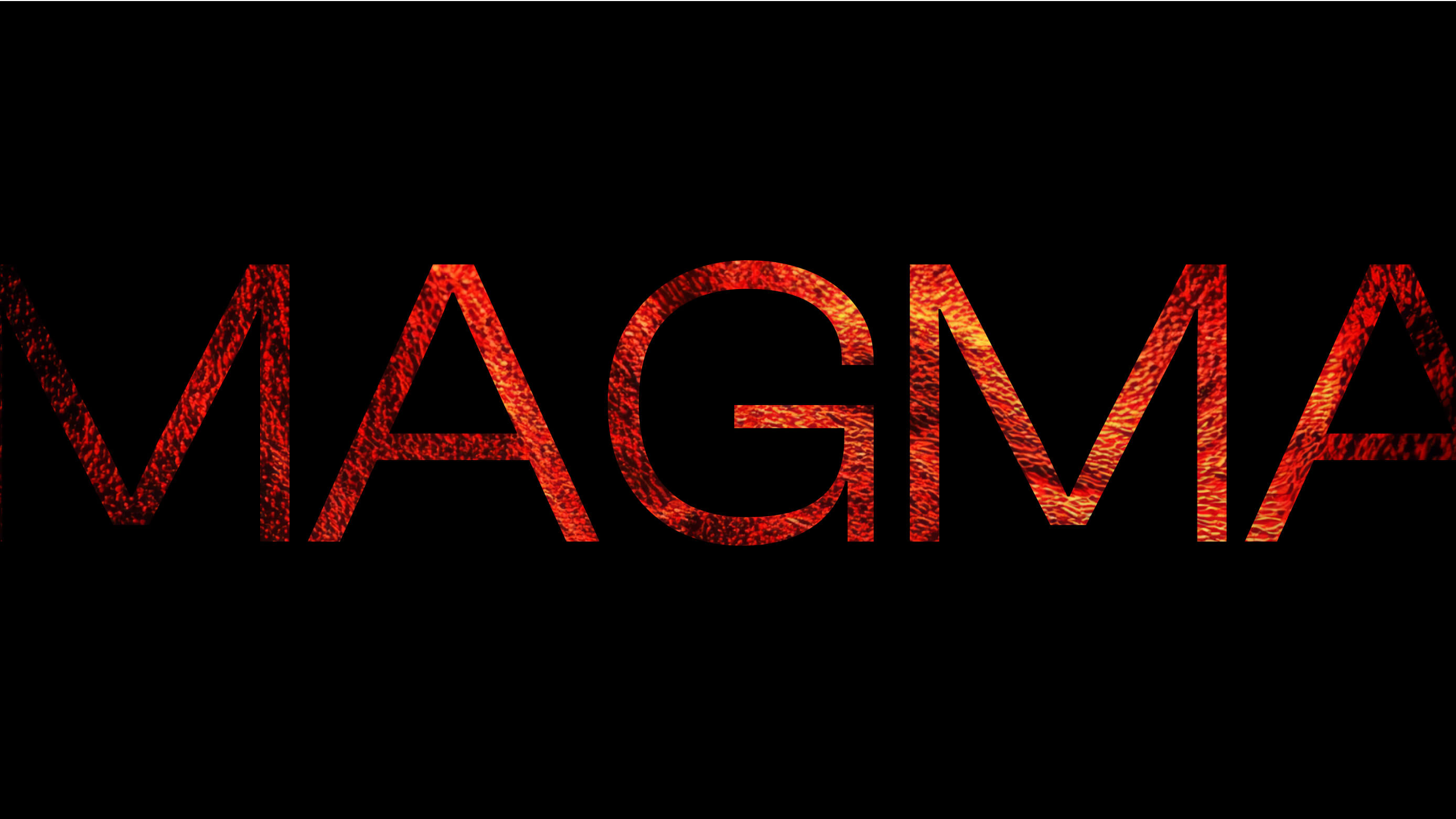
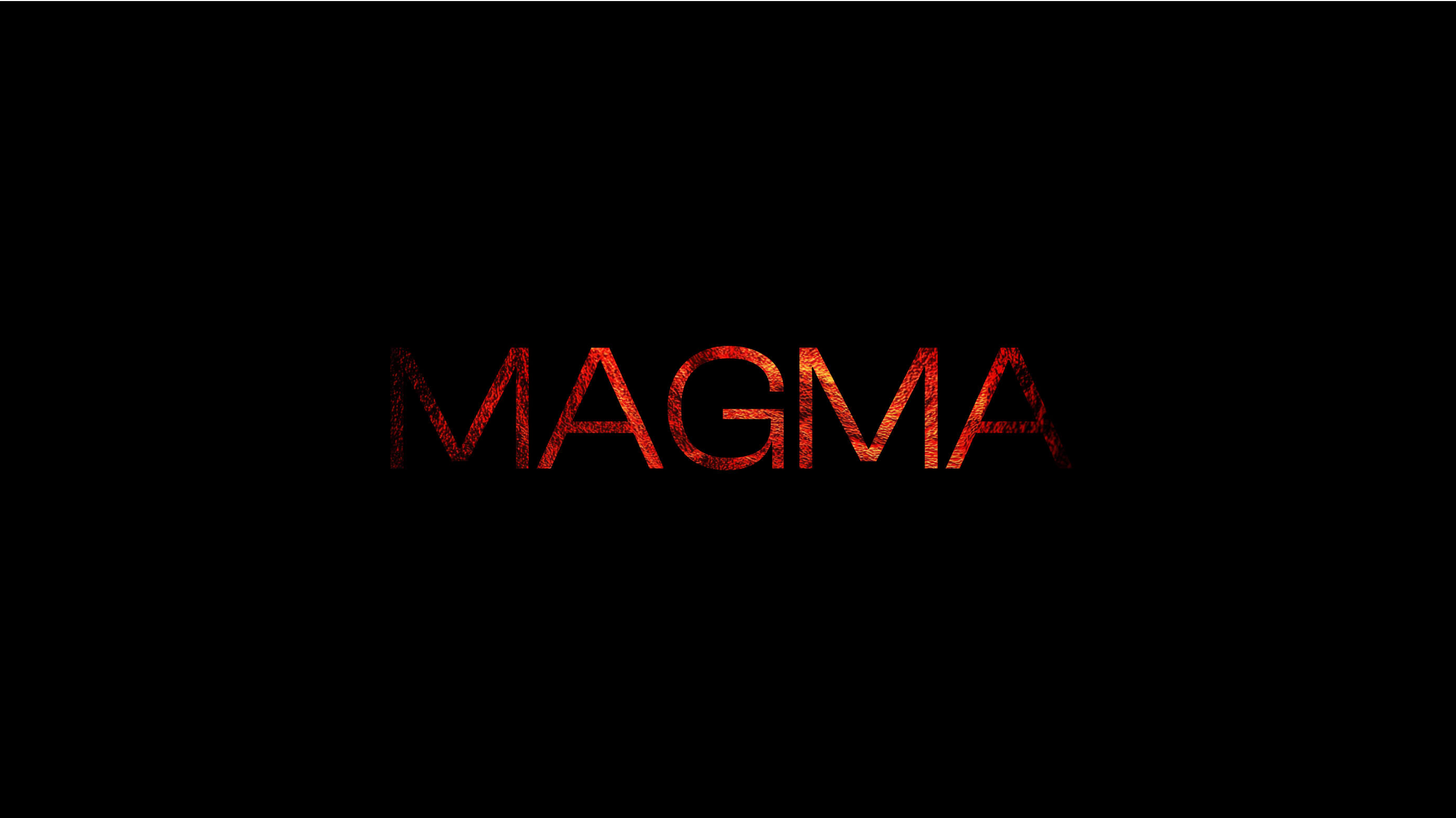
Magma logo rendered in glowing red texture
Molten lava texture beneath campaign titles
Magma title layout with minimalist typography
Magma logo rendered in glowing red texture
Molten lava texture beneath campaign titles
Magma title layout with minimalist typography
Magma logo rendered in glowing red texture

Photo Direction and Issue Focus

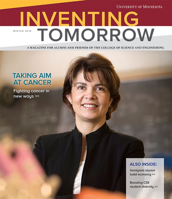
When I started working with the magazine, it had an established template that the editorial team was committed to maintaining. Within that framework I wanted to suggest changes to make the publication feel more dynamic and engaging.

I polled colleagues, faculty and alumni about whether they could identify any particular previous issues. The one reliably remembered was "the women's issue," featuring all-female story subjects.

So with my first issue as art director, I successfully pitched two changes: a dramatic redirection away from the strict posed headshot photos throughout every issue and a magazine-wide topical focus. I hired photographers with the skills I needed to capture action oriented images that grabbed attention and visually told our stories. I worked with editorial to identify broad topics to focus storytelling in each issue. This was the result:

Photo Direction and Topics

When I started working with the magazine, it had an established template that the editorial team was committed to maintaining. Within that framework I wanted to suggest changes to make the publication feel more dynamic and engaging.

I polled colleagues, faculty and alumni about whether they could identify any particular previous issues. The one reliably remembered was "the women's issue," featuring all-female story subjects.

So with my first issue as art director, I successfully pitched two changes: a dramatic redirection away from the strict posed headshot photos throughout every issue and a magazine-wide topical focus. I hired photographers with the skills I needed to capture action oriented images that grabbed attention and visually told our stories. I worked with editorial to identify broad topics to focus storytelling in each issue. This was the result:

AfterBefore
Before
After

Visual and Editorial Redesign

Building on these successful marginal changes, the team conducted a series of audience focus groups and comparative research to commit to a full redesign of Inventing tomorrow. While the audience of scientists and engineers continued to value detail and specificity, they responded positively to the engaging photos but were overwhelmed by some of the long-form features. We decided the whole magazine would pivot to prioritize larger, attention-grabbing images and illustrations, and the editorial would favor shorter, punchier stories peppered throughout with scannable facts and numbers. The first redesigned issue received a strong, positive response.

AfterBefore
Before
After